The MODERN Institute
June 8, 2008 7:05 PM Subscribe
The MODERN Institute
My new straight gig.
Whooda thunk that I'd be the founder of a charitable educational NGO? And Chairman of the Board? I guess that officially makes me The Man...
My new straight gig.
Whooda thunk that I'd be the founder of a charitable educational NGO? And Chairman of the Board? I guess that officially makes me The Man...
- If you are a design person, I would love to hear any feedback on getting this website prettier / more functional.
- If you are a coder, I would love to hear your feedback on making the website less buggy / broken.
- Most importantly, if you are a believer in what we are trying to do here, please pass on the link to funders, NGO people, potential partners, etc., i.e., help me pimp this thing.
Oh, and with so much great Roma music around, maybe you can try to use music in some way as to get more people interested in what you're doing. Just a few doors down from you in Hungary, MeFi's own zaelic is something of an expert on Gypsy music, and might be someone you'd like to ask about this.
posted by flapjax at midnite at 8:01 PM on June 8, 2008
posted by flapjax at midnite at 8:01 PM on June 8, 2008
flapjax: oi shit, the military thing never even occurred to me, I'll have to consider that... For me it was more like SimCity, and people, and integration, and green for growth... hmm...
posted by Meatbomb at 8:15 PM on June 8, 2008
posted by Meatbomb at 8:15 PM on June 8, 2008
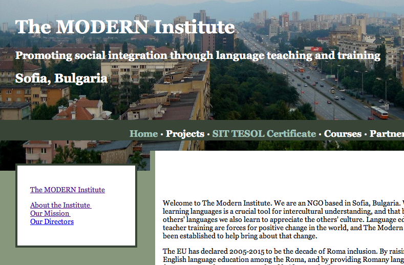
It's Sofia... you can see our office if you know where to look.
posted by Meatbomb at 8:17 PM on June 8, 2008
posted by Meatbomb at 8:17 PM on June 8, 2008
...the military thing never even occurred to me...
Well, of course, it may not really strike other folks that way either, but that was my first impression.
It's Sofia... you can see our office if you know where to look.
I wasn't suggesting dropping that image, exactly, it was more of the totality of the thing. Now that you mention it, though, I'd say that, although I like aerial views as much as the next guy, maybe you want to go with something a little warmer, friendlier for this site. I'm thinking something more immediately human, less abstract. Some sort of portrait, maybe, or some image of personal human interaction, which is what your foundation is about.
posted by flapjax at midnite at 8:26 PM on June 8, 2008
Didn't realize you were a brummie! I went to Birmingham Poly. If anything, work on the colors and font, it's eyewatering.
posted by parmanparman at 8:48 PM on June 8, 2008
posted by parmanparman at 8:48 PM on June 8, 2008
That's fairly good. It gets the information across (without making the reader battle the site too much) and that's the important thing. Here are a few things I'd try in order to make it look somewhat prettier:
* Change the font to Georgia - this is a serif font, which is more "delicate" and easier to read.
* Maybe replace the header image with a crop of this Creative Commons licensed photo (found through a Flickr advanced search for "Sofia, Bulgaria" with the Creative Commons option selected) - it's kind of neutral and should look fine behind your white title. Its license says you just have to credit the photographer, which you can do in the footer or whatever. I don't know anything about Sofia, so that might not be the right image, but you can look for other pictures on Flickr with Creative Commons licenses.
* Make the navigation links regular title case, like "Projects" instead of "PROJECTS", because uppercase is kind of hard to read. You can replace the separator pipes ("|") with dots (type "·" to make "·") for bonus readability.
* On the index page, change the "Welcome" title to "Home", to be more descriptive of where the reader is. Also, you probably don't want to invoke the "welcome to my home page!!!" thing too much.
* On the "SIT TESOL Certificate" page, fix the "Welcome" title.
The sidebar sub-navigation/info box may be a little confusing for people because its purpose changes from page to page, but I don't have any immediate ideas about how to restructure it. Also, keep in mind that I'm a total web design amateur who just likes messing around with this stuff. Good luck with the organization!
posted by dreamyshade at 3:40 AM on June 10, 2008
P.S. Screenshot of me trying those things. You can have the modified files if you want, but I kind of butchered the HTML and CSS and they probably wouldn't be useful.
posted by dreamyshade at 3:55 AM on June 10, 2008
posted by dreamyshade at 3:55 AM on June 10, 2008
Thanks for the detailed fb, dreamyshade. Seeing your screenshot does give me some food for thought.
posted by Meatbomb at 4:43 PM on June 10, 2008
posted by Meatbomb at 4:43 PM on June 10, 2008
« Older YA New York... | FlickrTwitterThinker: Thinking... Newer »
You know, as far as design, here's my two cents:
The combination of the aerial photograph at the top of the page, plus the Army green color scheme, plus the bold lettering all come togethger to give me the impression of, well, something kind of military. I'd say choose a more delicate font, something that looks a little classier, and play around with some different color combinations.
posted by flapjax at midnite at 7:56 PM on June 8, 2008